What is Koi Colour studio, and what services do you provide?
Koi Colour Studio is Norway's first multi-disciplinary colour studio, and our goal is to contribute with the targeted and effective use of colour within urban spaces, architecture, interior architecture, product development and graphic design. We offer advice, courses, development and strategic guidance. Our small team all have varied backgrounds, but in each case with a special focus on colour.
What made you want to set up a studio with such a focus on colour?
In architecture and design, there is a tendency to treat colour as an afterthought. Sometimes even an unnecessary detail. We know this to be wrong. The eye sees colour before we see form. And colours have an immense effect on our physical and psychological wellbeing. We are all fascinated by colour and material and its transformative powers in each our own way. Seeing the world drown in grey for the past two decades has certainly made us motivated to put our mark on our surroundings, one project at a time. It’s also really a privilege to work with such a broad range of clients, objects, materials, and spaces.
How do you go about developing a colour palette on a project - where do you start?
First, we need to understand the client, the business, the products and the spirit of the company. What makes it unique? What can we draw attention too? What fits the overall personality of the people working there? How will they thrive? What can we do to make the workplace somewhere they and their clients want to be? A place you feel like you belong to?
Where it’s easy to find focus and concentrate and deliver way above par, but also laugh, feel safe and taken care of. A lot of the preliminary work is analysis. Figuring out the client - how can we create an environment, that communicated the business, has a lasting aesthetic and increases staff motivation and results?
You know what we say; "only shallow people disregard the effect aesthetics have on us".
Onto your new workspace – can you give us some information about the design process there?
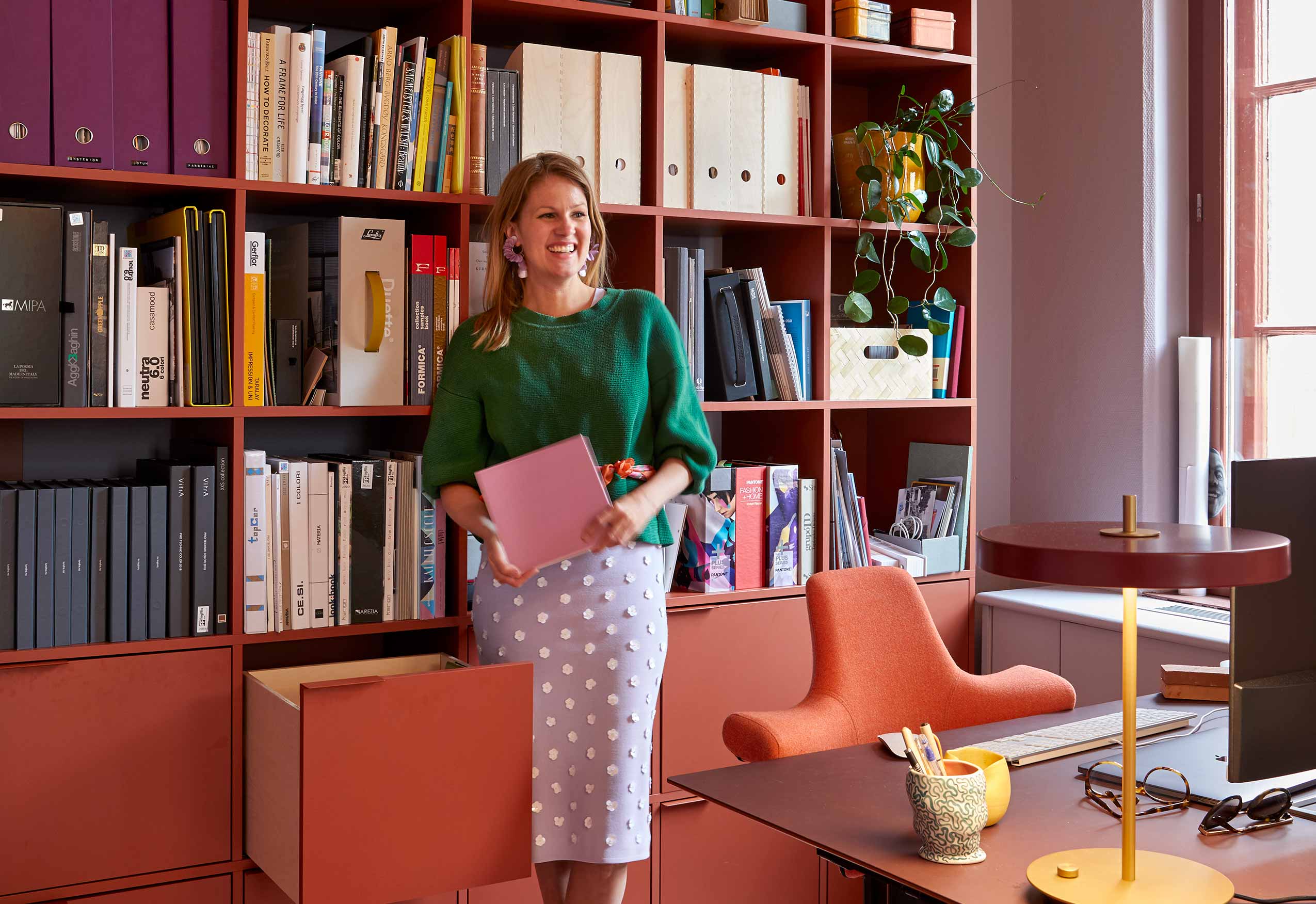
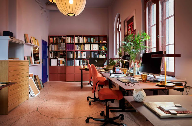
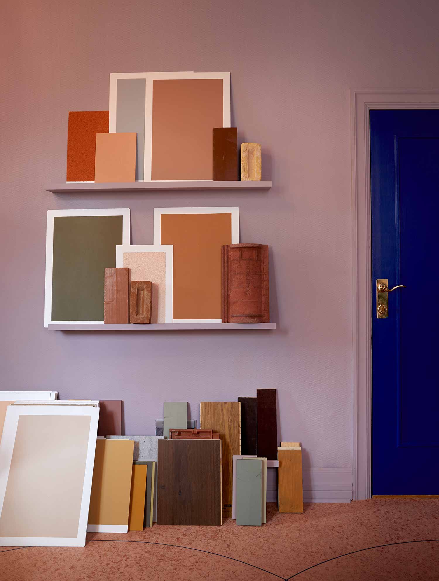
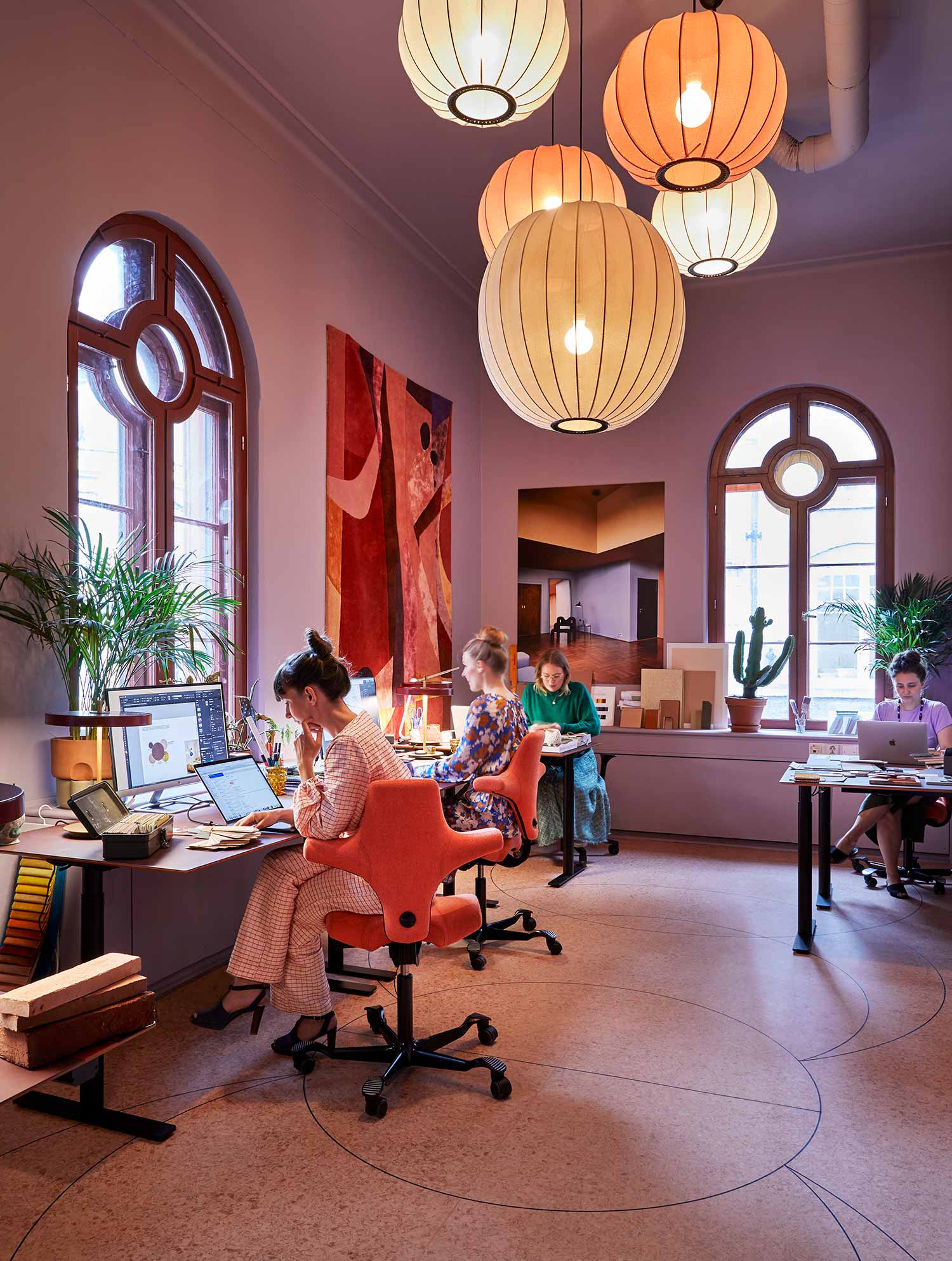
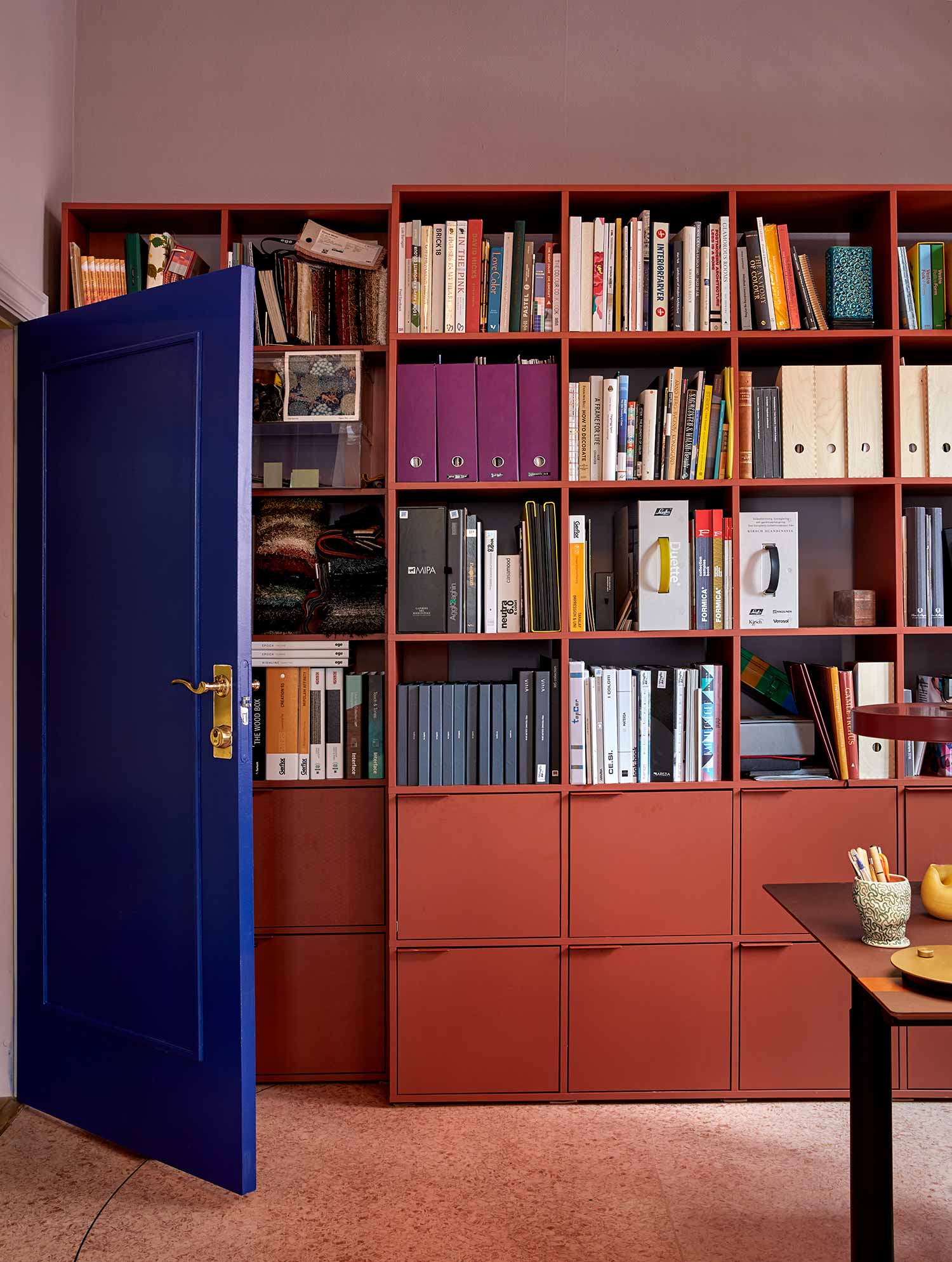
We designed our new offices rather organically. The wall, window and door colours came first. A dusty lavender on the walls, deep red window frames, and Yves Klein blue doors. This palette set the tone for furniture, lamps, and decorative objects.
Read - Flokk interior architect designs new office space for renowned craft brewery Northern Monk
You went for the HÅG Capisco Chair throughout your offices. What helped you make this decision?
The HÅG Capisco is a chair with a very special and recognizable shape. It has become a classic and we love that they are made to last, and made to be repaired. Ergonomically, the chair allows us to work an entire day at the desk without becoming uncomfortable. The colour we chose for our office is coral. It is a great accent colour with all the warm shades of lavender, brick red, burgundy, salmon. Saturated colours are best used on objects we want to stand out. And the HÅG Capisco certainly does.
Read - The story of a design icon - HÅG Capisco
In your opinion, what are the workspace colour trends looking like for the rest of the year, and into 2021?
Our clients are certainly over norm core white offices. Employees can work anywhere, any time. That means that offices today have to offer more than just a desk and a chair. We experience strong demand for personalized spaces, something more reminiscent of luxurious living rooms, warm and vibrant interiors designed specifically to increase efficiency, better creative processes and decrease sick leave. Colours and materials are a transformative tool to create beautiful spaces that people want to experience.
The key is to create a rich, complex and compelling colour palette that tells a story about the client and their goals and services. That’s what people expect when they come to us for help, and we are more than happy to oblige.
If you would like to find out more about Koi Colour Studios, you can visit their website here, or find them on Instagram at @koicolourstudio
Koi Colour Studios also worked with Planforum Arkitekter on this vibrant school interior project