02-2022_Giroflex4022456_Blue_resize

Forwarding the Giroflex DNA – ITO Design on creating the giroflex 40

International design house ITO Design share the story behind creating the giroflex 40, drawing inspiration from the history of Giroflex designs and the cultural heritage of the brand to create a new chair, advancing the DNA of the Giroflex design language.

When designing the giroflex 40, ITO Design wanted to create a chair that would seamlessly fit into the Giroflex family of chairs, but also one that would stand out. A design that not only followed the Giroflex design philosophy but advanced it.


An office chair that incorporates the trademark Giroflex synchro-motion & dual-zone seating approach, giroflex 40 emphasizes a softer, more simple, and intuitive approach to office seating.


“There is a big trend that in the office everything is becoming warm, less office-like.” say’s Christopher Schmidt, Team Manager at ITO, “Our approach was to create something untechnical and more homely, and with that comes a certain visual simplicity.”


Distinct expressions of this approach are evident in the soft rounded surface edges, the layering of materials in the backrest partly concealing the lumbar support, and the reduction on the size of the operating mechanisms, discreet, yet easy to operate. More subtle touches include flush armrest integration and wrapping the mesh backrest around to increase the coverage of the material.


Read - What is synchro-motion seating?

ITO 01-1

Christopher Schmidt, ITO Team Manager, part of the giroflex 40 design team

ITO 02-1

Hiroyuki Morita, Industrial Designer, ITO & creator of the initial concept of the giroflex 40

Swiss design traditions

One of the more noticeable visual features of the giroflex 40 is the “O” shape on the backrest, a feature that drew inspiration from Swiss design as well as the design language of previous Giroflex chairs.


“One aspect of the Giroflex design language we perceive is an organically sculpted shape built around a circle or sphere. You can see this developed in the chairs made by Paolo Fancelli - giroflex 313 and  giroflex 353. We thought it would be interesting to link this idea also to typography – something for us which is very tightly linked to Switzerland – and perhaps not have a strictly geometric circle as seen previously.”


The International Typographic Style, otherwise known as Swiss Style, has dominated our screens, advertising, and books for over 60 years, with Max Miedinger’s Helvetica Neue, for instance, probably the most successful typeface in all of history. The principles of Swiss Style are simplicity, readability, and rationality, ideals not only important for typefaces but also equally transferable to products such as the giroflex 40.


As an international design house, ITO Design enjoys a multicultural approach to designing its products. With offices in both Germany and Switzerland, they also have a natural affinity to Swiss Design principles. Japanese designer Hiroyuki Morita, who studied at the prestigious Swiss design school ECAL, presented the initial concept for giroflex 40. (In fact, one of his professors was BIG-GAME founder Augustin Scott de Martinville, designers of several Giroflex chairs.)


Hiroyuki Morita; “Historically Switzerland has played a big role in developing typography. We came up with this idea to imbue the Swiss heritage of Giroflex into the new chair. It has become so common these days. Everyone has access to it and we have lost how ground-breaking it really was. It’s not flashy, it uses simple shapes, but in a way that is distinctive.”

G40_initial sketch_01

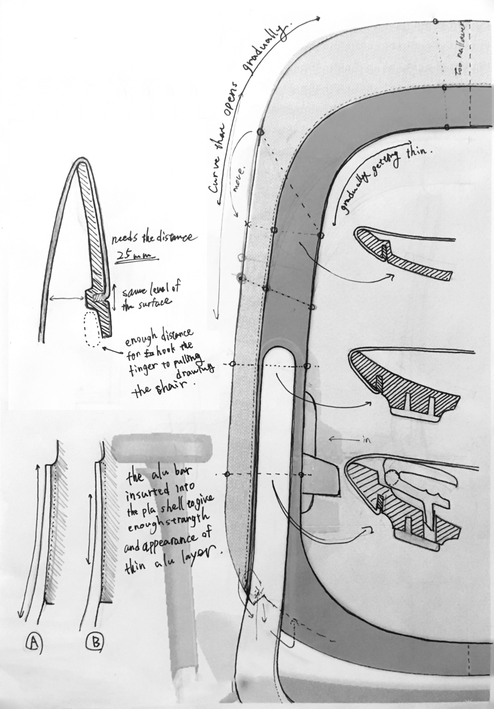
Initial sketch of the giroflex 40 by Hiroyuki Morita, exploring the layering concept as well as the 'o' shape

IN_giroflex 4_instastories 08

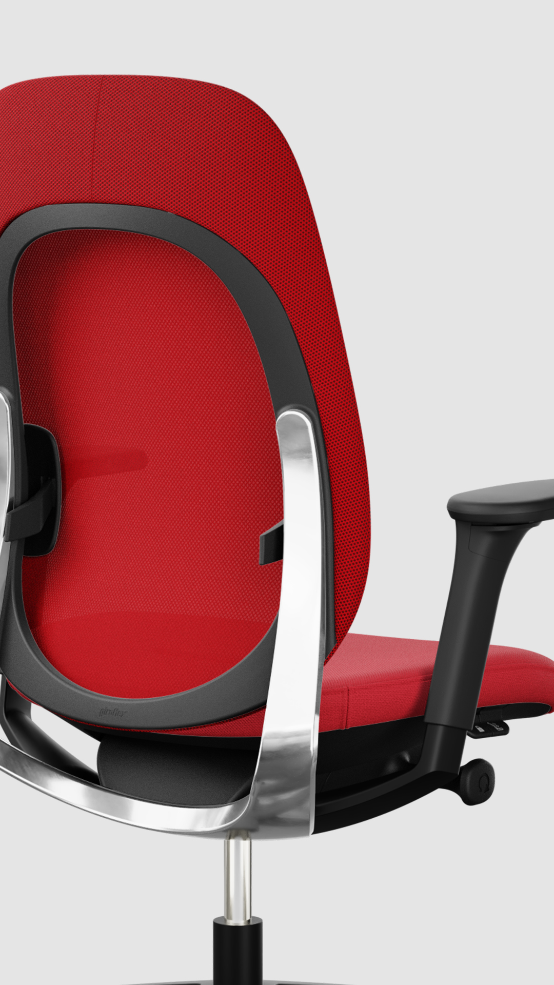
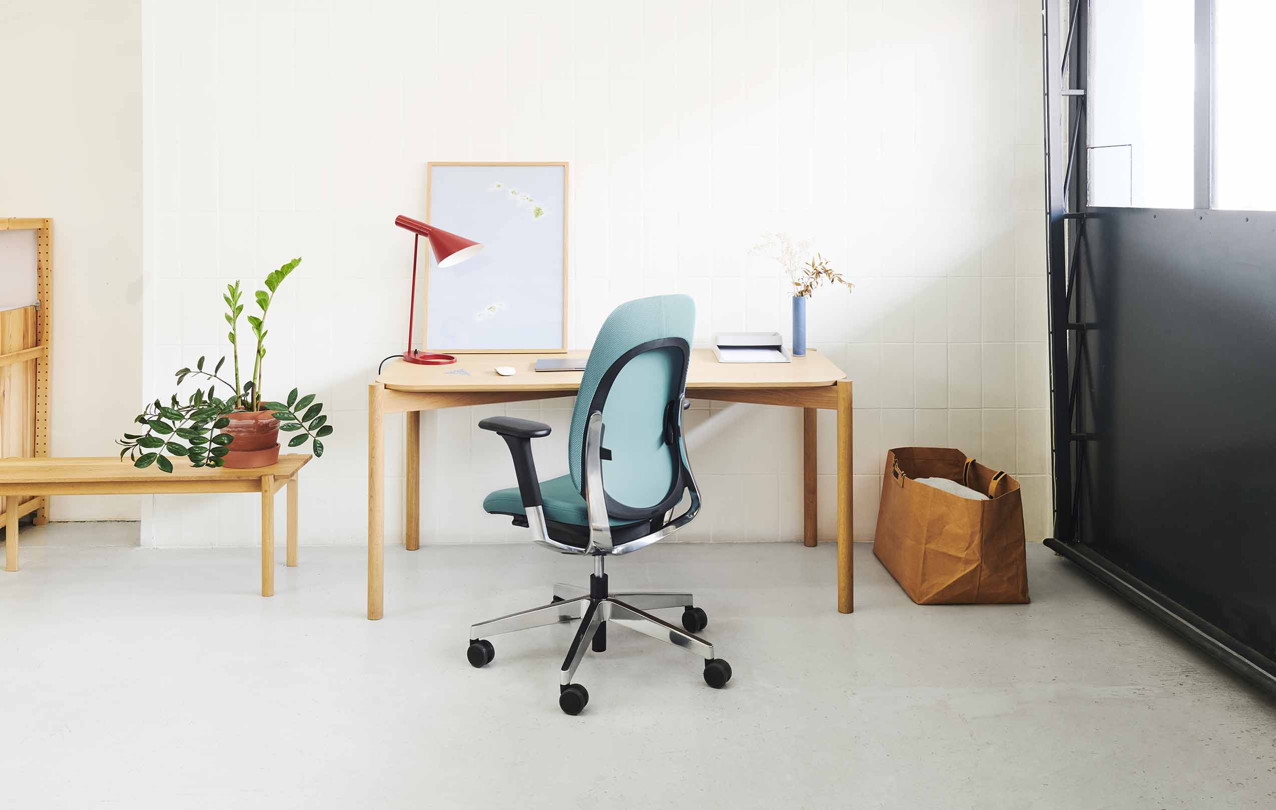
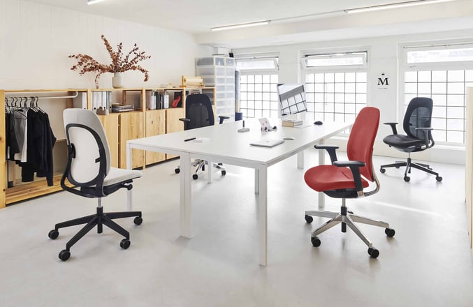
The finished product - Closeup of giroflex 40

Circular design

As with all Giroflex designs, creating a chair that followed circular design principles was a given, which meant non-toxic materials and designed for disassembly. This was initially a challenge when it came to the layering aesthetic element of the design, specifically the backrest, where the aluminium meets the plastic.


“Visually, the aluminium shape appears to be a thin layer on top,” says Christopher Schmidt, “but it does have more depth if you look at the section internally. The design is such that it offers the support, can easily be broken down, and provides the particular aesthetic we were going for.”


Find out more

Giroflex 40 is an elegant, energizing contribution to a work environment, with its health-focused purpose designed with a harmonic approach. Available in combinations of a mesh backrest and fabric seat covering, colour-matched in 5 different color options of red, blue, grey, beige, and black. Click the link below to find out more.


Discover giroflex 40

This might also interest you